Write On! Features: Visual Storytelling For Book Covers by Stuart Lee
- 6 November 2026
- News, WriteOn Features
By Stuart Lee
Hello!
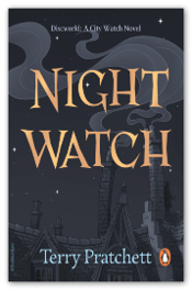
As an artist and video game developer, I’ve been involved in visual storytelling for over 15 years – on a wide variety of games, including: Avatar: Frontiers Of Pandora while at Ubisoft. I’m now working on designing and illustrating for books and I’m going to share my process using my recent Night Watch cover redesign as an example.
 The Brief
For this project the brief came from Penguin’s annual cover design competition. It contained all the essential details about the work, including practical considerations such as dimensions, the text to include, submission details and even a design template including logo placement, etc. Whether it’s a client brief, a competition entry or even a self-initiated project, it’s important to understand all the details of what you’re setting out to create before starting, to make sure you head off in the right direction.
Research
The first bit of research is, of course, to read the book and identify the key features and/or interesting parts of the story that could translate into an eye-catching cover. Something that gives the potential reader an idea of what the book is about, but without any major spoilers. It’s worth mentioning here that a book cover shouldn’t just be a scene from the book, recreated as if it’s a still from a movie. The cover is there to give an impression of what the book is about – the overall themes and tone.
Once you have some ideas about what your cover might include, you can go on to research those topics.
If possible, primary research is the best option. This means going and looking at the thing, directly, in person. Whether it’s something in nature, or a building or interior of the style you’re looking for, gathering your own reference in person and really looking at the thing you’re researching will always be the best way to understand and get the details right, and maybe spot something you weren’t expecting.
But what if the thing you’re researching is fantasy or sci-fi, and doesn’t actually exist? Most things, even fantasy creatures, are based on something from the real world, so you can research those things to inspire your creation.
It’s not always possible or practical to go in person, but there are plenty of other options. I’ve made a list of the sources I use the most, with some pros and cons:
- Online images searches – Quick, easy and readily available, but be careful and consider the source to make sure it’s authentic, correct information.
- Libraries – Great source of reference and much more likely to be a reliable source of research, and to discover things you didn’t know you were looking for but are very interesting.
- Bookshops – Good for seeing what’s already available/expected in your genre and to see what your book might end up next to on the shelf. Remember it’s other artists work, so not primary reference, and don’t copy the content.
- Pinterest – Lots of images on many topics. Many subjects are oversaturated with AI-generated nonsense, full of adverts and lots of other people’s work, so it can be hard to find legitimate references for some things.
- Museums and Art Galleries – Many have online catalogues of their collections, a great source of authentic, curated reference.
- Online clothing stores – A great reference, especially for children in specific age groups, so you can target exactly the age you need for your project.
Mood Board
After collecting all the references, I curate them into a mood board, taking only the pieces that are really useful and/or relevant, such as a specific detail of how something is constructed. I use Miro (miro.com) to make my mood boards. It’s an online whiteboard that’s free to use for a limited number of boards.
Sketching And Colour Roughs
With all the research and ideas popping in my head, it’s time to start sketching.
I try to do as many and as quickly as possible and not be precious about them. The purpose is to get all the ideas out and quickly see what is working and has potential to develop further.
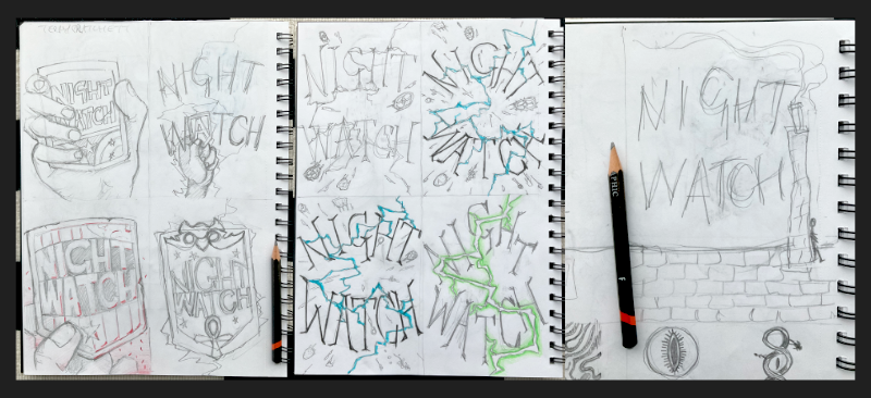
After the quick sketches, I pick one or two of the best ideas to develop. I do larger drawings, with more detail and some variations. At this stage, it’s still fairly rough and ready, and I might combine parts of two sketches and chop and change things around. This is the part where you’re really working out your composition: where the focus is, what kind of action is taking place and how the camera angle and elements in the scene are telling the story and, of course, how the lettering will be incorporated into the design.
At this stage, I’ll also start blocking in some colour, which also contributes a lot to the storytelling.
Colour
It’s a good idea essential to have at least a basic understanding of colour theory and, as it’s such a fundamental subject, I encourage everyone to look at this topic in more detail in a stand-alone class. There are many available online, or in books on the subject. Colour affects mood and tone, and there are various cultural associations with different colours that will all have an impact on the work. Knowing about colour theory will also help you make a good colour palette, and there are lots of online tools to help with this too.
For my Night Watch cover (it’s a night-time scene which suggests dark blue – night-time is very commonly depicted as being blue), I decided on a monotone palette, with the lettering as the main element. With the background being blue, a cool colour, I went for yellow/orange lettering – a warm colour and blue’s opposite on the colour wheel, making it a complementary colour palette with great contrast. I picked a copper tone, partly because it’s less common than the typical gold lettering often used, but also because it’s a story about the police force, who are frequently referred to as ‘coppers’ throughout the book. Pun intended.
Optional 3D Step
Depending on the project, I sometimes do a 3D step if I need a bit of extra help with perspective or a complicated composition. I’ve worked in 3D for many years, so am fast at doing rough 3D blockouts of the objects I need and can do this relatively quickly (just like a rough sketch stage). It’s not something I’d do for every project, but sometimes it can be really helpful.
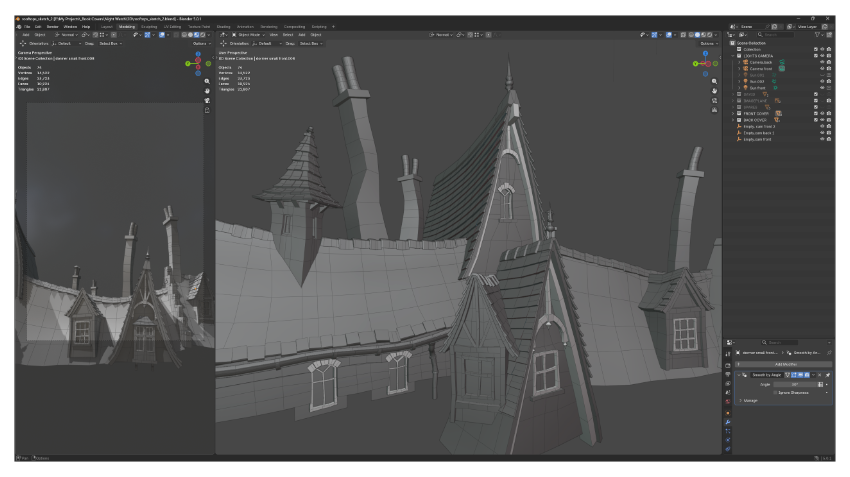
I set up a camera in the scene with the dimensions of the cover, and lock one viewport to that camera view so I can always see the final result. Then I can use another view to move the objects around in the scene and work out the composition. This is also useful for getting an indication of lighting, since I can put a light into the scene and try different options until I get something that looks good.
Once that’s all done, I render off the camera view and use that as a guide for the illustration, just like I would with a sketch.
Line Art
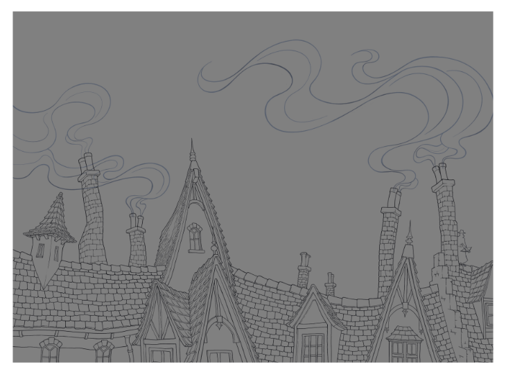
This is also a personal preference thing: the lines are part of my style and part of the final image.
Having worked out the composition in the sketch, I take that into a digital drawing program such as Procreate on the iPad to use as a guide. I set the sketch layer to be very transparent so I can see it but it’s easy to draw over, and then on a new layer draw the final line art. For my Night Watch cover, I used the 3D render as my sketch and drew over that, adding all the additional details such as the roof tiles and brickwork.
TIP:
Avoid tangent lines. This is an effect where the lines of one object are very close to or line up with another object and the proximity suggests a relationship where there is none. For example, someone wearing a wide-brimmed hat, standing in front of a wall. If the top of the wall and the bottom of the hat line up, it can be confusing, because you’re not sure where one things starts and the other ends, or if they’re part of the same object.
Lettering
For main title lettering, I prefer hand lettering and don’t usually use pre-made fonts. The lettering is such an important part of the cover, so I like to have full control over that. It also makes a big impact on how custom and individual the cover is, since no one else will have exactly the same lettering. For other text items, such as author name and back cover text, I will sometimes use a font.
The process is similar to the other elements of the cover, starting with research. I will look at other covers in the same genre to see what’s usual or expected, and then I can decide to go along with that, or away from it, depending on the project.
For my Night Watch cover, I wanted the lettering to be sharp to reflect the danger present throughout the book of an assassin stalking the protagonist. Also the wonky, ramshackle nature of the world is carried through in the unevenness of the letter shapes.
A note about raster vs vector format for lettering – vector is generally the better option, because you can scale vector images without quality loss. Raster images are better for complex detail such as photographs, but being made up of rows of square pixels, they will lose quality and become blurry when scaled.
After the line art and lettering is done, I’ll do a pass of adding flat colours for everything. One colour per layer, separate to the lines, so it’s easier to adjust or recolour each element.
Details And Lighting
The final stage is to add all the details including shadows, highlights and surface details using texture brushes, etc. I often add gradients to objects, particularly big shapes, to create more depth and stop the image looking flat. A small amount of grain using a noise filter is also good for adding a little more surface detail and to prevent banding of colours when using a gradient.
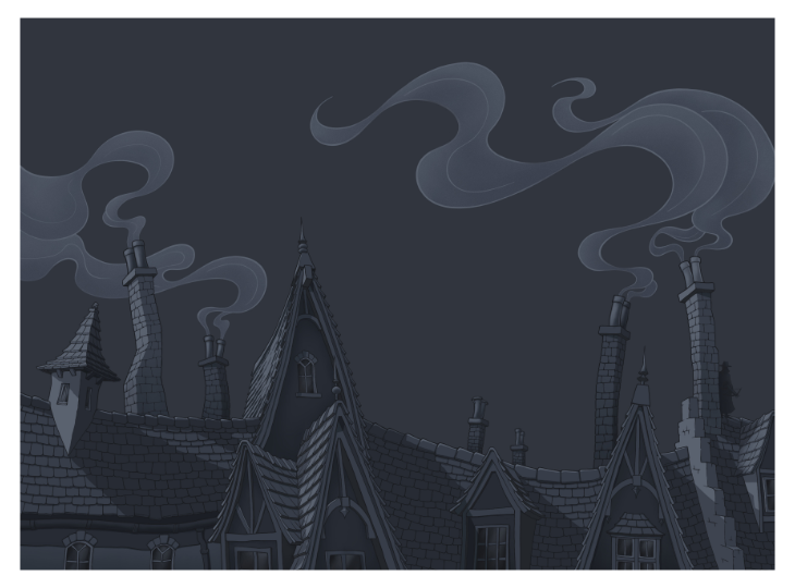
In my Night Watch cover, there’s a strong light source from one side, so the shadows are very distinct, as are the highlights on the sides facing towards the light source. I also added some texture to certain areas such as the chimneys to make them look a bit more worn and dirty. I often colour the line art too, so it’s not just a black outline. In this instance, I varied the value (light and dark) of the lines around the smoke coming from the chimneys, which adds to the sense of movement.
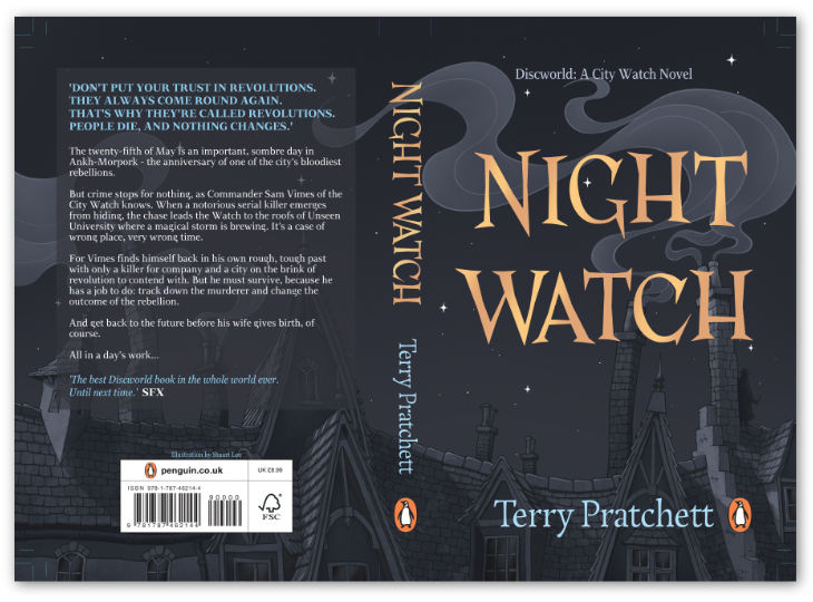
Once all the elements are complete, including the lettering, text, logos, etc and the final cover design is finished, there’s one last thing to do for presentation purposes…
The Mock-Up
A mock-up is useful to show the design as it would be in context – i.e. on a book once it’s printed. There are lots of mock-up book assets available online, which you can download (many for free) and place your cover design into the template to see what the final result will look like. It’s a great way to present your work, particularly for a personal project that might not get an actual printed version.
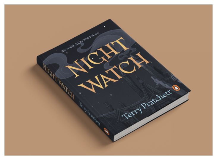
So there you have it: the full journey all the way from the initial spark of an idea through to a finished book cover. As always, there are many different ways to approach any creative project, so I hope it was helpful and there was something in there that you found useful or interesting. Good luck with your own book cover design projects!
*****
Issue 30, featuring Gillian McAllister, is out now. You will be able to find it in libraries and other outlets. Alternatively, all current and previous editions can be found on our magazines page here.
You can hear great new ideas, creative work and writing tips on Write On! Audio. Find us on all major podcast platforms, including Apple and Google Podcasts and Spotify. Type Pen to Print into your browser and look for our logo, or find us on Podcasters.Spotify.com.
*****
If you or someone you know has been affected by issues covered in our pages, please see the relevant link below for information, advice and support: https://pentoprint.org/about/advice-support/
Related News


Showcase: After + The Dinner Club + Oceans Have Emotions + Ageing Gracefully
- 3 January 2024
- News, WriteOn Showcase
