Write On! interviews book cover designer Tim Barber.
 Tim Barber is a book cover designer with a passion for books. He’s designed hundreds of Amazon #1 bestsellers and won various awards over the years. If he’s not wandering around Waterstones studying every cover, he’s at home with his wife and 20-month-old daughter.
WO: What type of art do you specialise in?
TB: I specialise in book cover design and creating LookBooks* for the Film and Television Industry.
*LookBooks are what Production Studios use when they are selling TV or Film concepts to Networks (Amazon, Netflix, Apple etc). They are visual representations of the Film/series that accompany the script and Screenplay.
WO: Can you tell us a bit about what you are working on at the moment?
TB: At the moment I’m juggling multiple projects, which seems to be the norm these days. I work with Indie Authors, Publishers, and TV/Film Studios, so the combination of the three keeps me on my toes. At the moment, the main project I’m working on is a book called The Unforgiven Dead for the American Publisher Inkshares. It’s also being adapted for a feature series, so I’m working on the accompanying LookBook based on the Screenplay and script.
WO: What inspired you to become an artist and what inspires you now?
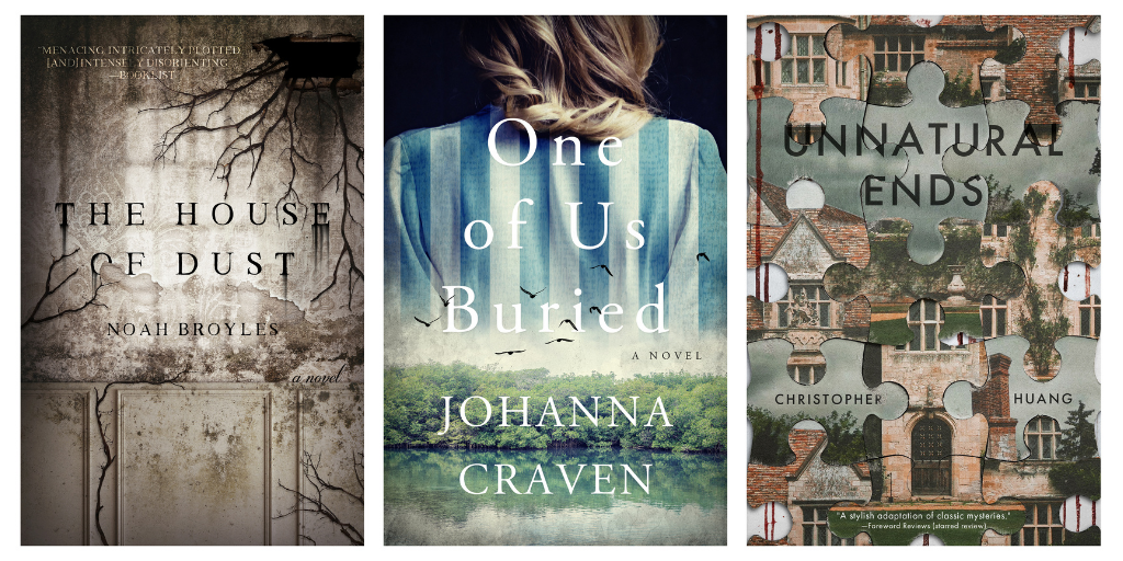
TB: I started my creative journey as a photographer, with an obsession for all things abandoned. I spent much of my twenties exploring abandoned hospitals, asylums, and factories. This seemed to naturally progress into the use of Photoshop, which I soon became skilled in. As my journey continued, my focus moved onto book covers; not me designing them, but the beauty and sheer creativeness of them. I discovered the likes of Chip Kidd and Archie Ferguson and fell in love with their work and the almost unlimited diversity of the art form. My new obsession was born…
What inspires me now is the not knowing what will come next. What I mean is, one day I can be working on a financial advisory book and the next, I can be designing a Vampire novel set in Victorian London. It’s the diversity that really inspires me. Plus, artwork by designers such as David Drummond and Will Staehle constantly makes me want to do better.
 WO: The recent issue of Write On! explored the theme ‘Nature, Inspiring Creativity: Past, Present And Future’. With that in mind, how has nature had a direct impact on your inspiration? Are there any particular art or creative works based in nature that spark ideas for you whenever you experience them?
TB: My journey with photography has always featured nature at the forefront and it plays a big part in my creativity. My main photography passion is how nature always finds a way to survive and thrive, even in the most unexpected places. When I photograph abandoned buildings, it’s how nature has interacted with its decaying surroundings that fascinates me. That also very often comes into my book cover design. Part of my style is to create landscapes and scenes featuring nature and it’s this part of designing covers * I enjoy the most.
WO: The current issue of Write On! explores the theme ‘Mind Your Language’. With that in mind, have you ever faced any linguistic barriers when creating your art?
TB: When a publisher or author sends over a brief, I have to be mindful of the language they use. I have to be aware that one person’s interpretation of something could well be very different from another’s. For example, a client may describe something they can visualise clearly and I have to be very careful I’m on the same page as them when I’m pulling ideas together for a project. I find the best way to get around this is to triple-check everything, even if that means I’m repeatedly asking the same questions. I find it’s better to be thoroug than to produce a draft that’s not how they envisaged it. A recent example: a client described they wanted the title to “jump from the page”. Now, this could be interpreted in a few different ways: They want the title large, or they want the title colourful, or they want the title 3D, or they want a certain font, etc. After a conversation and gaining more information, I realised they actually wanted the title fairly small on the page, but they wanted it to be a conflicting colour to the palette of the background. My advice: Communication is always key and triple-check every detail.
WO: What one piece of advice would you give an aspiring artist?
TB: Keep working hard and keep following your passions. If you really enjoy something, the terrible pay and long hours you first have to endure won’t be such a big deal because you’ll be doing something you love. I’d also say never say no to any job offered to you, even if you have no idea how you’ll do what the client asks. Say yes and then work hard to make it happen. Once you’re more established, you can pick and choose to a certain extent.
 WO: What are the biggest issues (if any) you have to navigate as an artist?
TB: Creating art is very enjoyable, but turning that into a full-time business has elements that aren’t so enjoyable: Constant emails coming through, sorting your tax out, and trying to decipher cover briefs that make no sense, are all things that can get on top of you. But, at the end of the day, if you’re doing something you love, putting up with these things is a small price to pay.
WO: Can you tell us anything about future projects?
TB: At the moment, I have 15 authors booked in waiting to start and I have publishers sending me briefs weekly. The future looks very busy and I feel very lucky to be in the position I’m in.
WO: Lastly, if you could choose one fictional animal/creature to be a pet or companion, who would it be and why?
TB: I would choose Dobby the House Elf from Harry Potter, because I’d train him to reply to emails and do the zoom calls for me!
*****
You can find out more about Tim Barber and how to submit to him here: dissectdesigns.com.
*****
 Issue 12 of Write On! magazine is available now. You can find it here.
Each edition of our Write On! Audio podcast features an exclusive interview. Find us on all major podcast platforms, including Apple and Google Podcasts and Spotify. Type Pen to Print into your browser and look for our logo or find us on Anchor FM.
*****
If you or someone you know has been affected by issues covered in our pages, please see the relevant link below for information, advice and support: https://pentoprint.org/about/advice-support/