 When you think of your five senses, which would you say drives more of the decisions you make on a daily basis?
What to eat?
What to watch?
What to wear?
What to drive?
And yes, what to read?
If you said sight, I would place you with the vast majority of people.
Humans are immensely visual beings. So much so, that what we see can alter our perception and mood, creating desire and urgency in less than a single second. And a second is all the time an author gets to present their work to potential reader,s as they scroll relentlessly through hundreds of titles in search of one that speaks to them.
So, then, how does an author distill down the full breadth of their story into a single image? One which will speak to potential readers so quickly they notice it at scroll speed and decide to click for a look at the blurb?
That’s where design comes in.
Just as an author carefully designs their story’s plot, so the arc carries the reader along on a journey with the characters, and a cover artist must carefully design the look for each book they work on to ‘sell’ the story within its binding.
I like to break the design down into three categories. First, I’ll list them, then we’ll look at each in more detail.
- Genre
- Focal Point
- Titling
OK, so what am I on about?
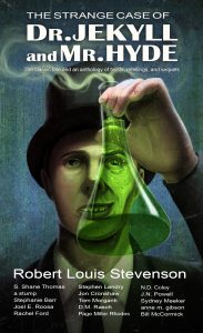 Let’s start with Genre.
At the most basic level, this is really quite simple. If the author has written romance, don’t put a ninja dual on the cover. But wait, what if the author has written a romance between ninjas from feuding dojo’s — a sort of twist on the classic Romeo And Juliet archetype?
Well, that complicates things. And that is where artist/author consultation comes in. Finer details are required to make sure the cover tells the reader exactly what they’ll be getting. Do the MCs fight for much of the story and fall for one another in the end? Or are they in love early and fighting their own respective dojos to break free from the chains of oppression?
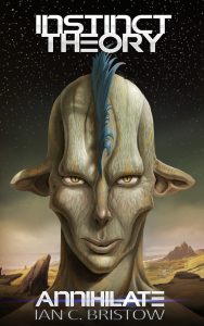 Selling a book’s genre is vitally important in the cover art, and that’s why I place it as the first item in need of attention at the start of the design phase.
But there’s a catch.
Once can actually ‘oversell’ their genre, i.e. the cover is so generically cliché the potential reader sees no promise for a new story. So it’s important for the author to dig out what makes their story unique when briefing an artist.
Now then, all the genre tropes in the world won’t make a piece of artwork good if the viewer has no idea where to look first and nothing holds them. That’s where the focal point comes in.
When a person looks at a piece of art, they might think they’re in control of what they see but, in all honesty, good art works a bit like mind control, and the artist at the other end tells the viewer what is and isn’t important in the piece.
So, how do we create a focal point? The simple answer is contrast. More specifically, contrast in value, which in art terms means how light or dark. The most extreme being white and black. The eye is drawn immediately to the highest point of contrast in a piece of art.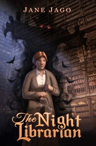
So, in a nutshell, you place the most important aspect of the cover in a pleasing location within the canvas (I won’t get into the details of how that works here) and then you put the highest point of contrast in the piece on or against that important aspect, and you have a focal point which draws the viewer’s eye directly to whatever aspect of the cover sells the genre and story.
And last, but certainly not least, we have titling.
Titling must work in tandem with the genre and focal point, or the cover will fail marvellously. Few things say ‘cheap’ or ‘novice’ cover like sub-par titling. This is one of the key aspects which separates being a cover designer from simply being an artist hired to make a cover. Not only does the title need to sell genre even more effectively than the artwork, as it can make or break viewer interpretation of the overall design, it also needs to pop off the page and remain legible at thumbnail size without distracting from the aforementioned focal point. A title must hold the promise of quality a reader instinctively carries with them when browsing for a new book.
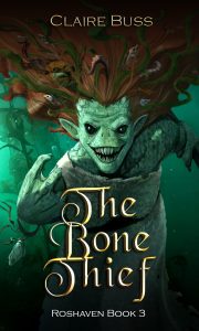 So, how can putting words on the cover go from making the reader think ‘noob trash’ to ‘bestselling author’? It’s actually quite subtle, and in many cases comes down to what the designer doesn’t do, so much as what they actually do. The right font, spacing, size, placement and ornamentation, all adds up to create something the viewer can feel but probably never explain. A good designer might spend more time choosing a font than they do working out the rest of the composition, and it’s this attention to detail that will speak volumes in the finished product.
So, to sum up, cover design is the first chance an author has to offer a reader the promise of good entertainment they worked so hard to provide within the pages of their story. Think of it as the visual blurb that comes before the written one. Selling the genre without becoming so cliché that the reader thinks they’ve read your story before giving it a chance is vital. A solid focal point will make sure the viewer knows what you’re selling them before the next fateful swipe of their finger removes your book from their sight. Titling will make or break the overall design and should work in harmony with the other two key aspects of the cover, creating a professional feeling which speaks to potential readers on a subconscious level.
At the end of the day, an open, transparent relationship between the author and their designer, with both open to compromise, will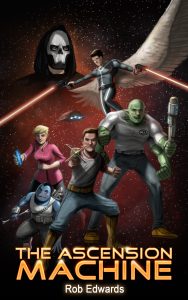 lead to the most successful work. On the most fundamental level, the author must learn to understand the many limitations a single piece of art will have in telling their ‘whole story’ and choose a single statement to sell the whole, and the artist must learn to understand how the written word best translates into visual art, so they are able to communicate that single statement in a way that will stimulate the author’s target audience.
*****
You can connect with Ian at: facebook.com/bristowdesign and on Instagram: @art.with.ian
*****
Read the latest issue of Write On! (12) magazine online here.
You can hear great new ideas, creative work and writing tips on Write On! Audio. Find us on all major podcast platforms, including Apple and Google Podcasts and Spotify. Type Pen to Print into your browser and look for our logo or find us on Anchor FM.
