How Authors Can Inspire Great Design
By Carol Van Den Hende, MBA
Why design?
When we consider storytelling, we usually think of the written or spoken words that make up the tale. However, we shouldn’t underestimate the power of book covers to evoke emotion and spark interest in a story. After all, humans are visual creatures. Vision activates more than 50% of the brain’s cortex!1 Think about how you feel when you see an image of a cub versus a fierce lion, or a contrast of colours compared to a harmonious palette.
As a brand marketer for 15+ years, I witnessed first-hand the impact of design visuals on good purchase decisions. Red and yellow can be paired to interrupt a package design and scream ‘discount’. Green is often used to denote environmental sustainability and certain shades of blue can be calming and rational, which is useful to communicate efficacy.
The power of design applies to books, too. It’s a critical element in a publisher or author’s toolset to break through and convey meaning. Let’s examine each of these concepts, and five tips to spark great design (which can be described using the mnemonic SPARC). Note: these tips are for authors who have a collaborative role in the design briefing and assessment process, and may be less actionable for others.
Break through is the ability to stand out in a cluttered environment. This is necessary, because your book is competing in bookstores that carry thousands of titles, or online marketplaces with millions of options. To navigate this sea of choice, readers rely on various means to pick a book, such as credible sources (bestseller/best of lists, awards, news outlets and other media), friend/library/bookstore/Goodreads recommendations, or simply by browsing and picking up a book that ‘catches attention’.
Catching attention can come from a title that grabs, well-written copy, an enticing endorsement blurb, or a known author. All of that together, what the cover communicates altogether to the reader, is what we call ‘meaning’.
Tip One: Simplicity breaks through, so don’t try to stuff everything onto the cover. Rather, focus!
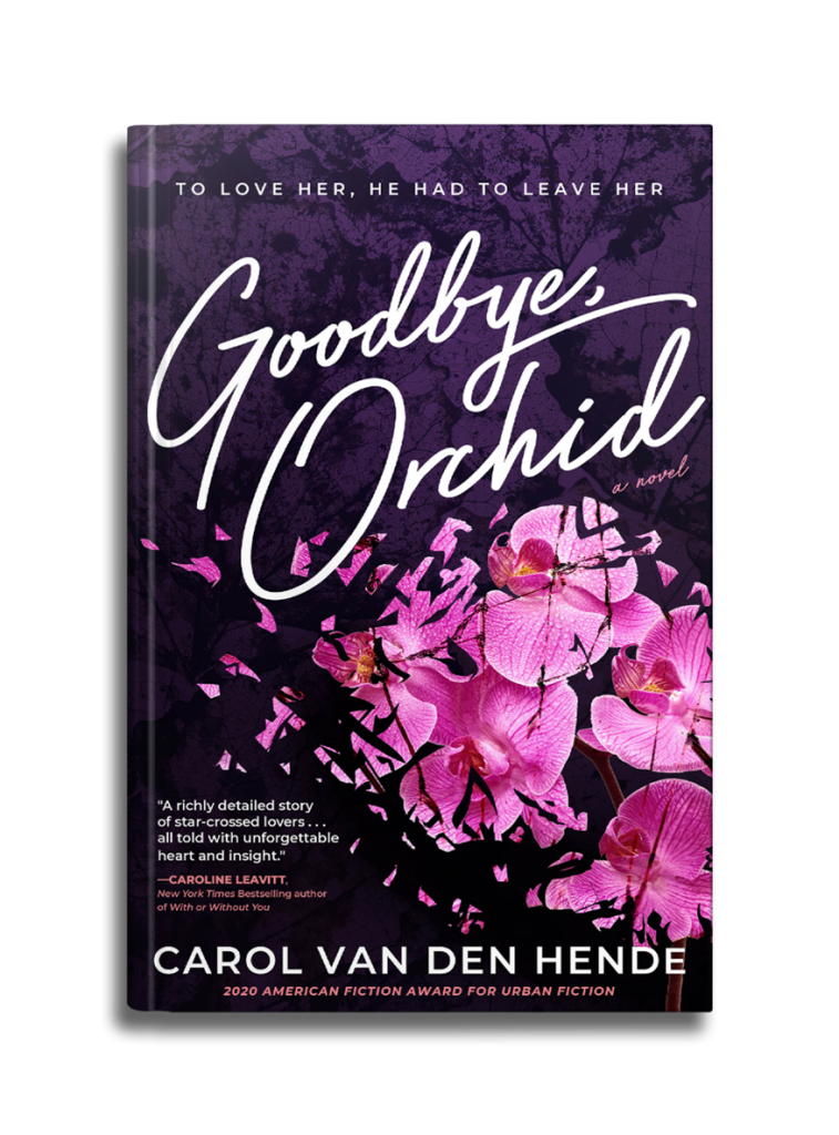
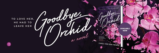
It’s hard enough to summarise our full-length books into a publisher synopsis, back cover blurb, logline or title. It’s that same intensity of focus that’s needed to determine what key aspect of the book will most motivate a reader on the cover. This single-minded insight can be shared with designers in a creative brief, sometimes called an author questionnaire. For instance, I briefed my publisher that Goodbye, Orchid’s central tension was the emotional and physical shattering of the main characters, Phoenix and Orchid. That tension is captured through the image of shattered orchids on the cover.
Tip Two: Prioritise your communications hierarchy.
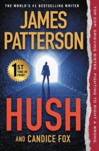 To focus, it can help to determine what you’d like your reader to notice first, second and third (recalling that Tip One exhorts simplicity, we likely shouldn’t have more than three – five priorities). We call this prioritisation a ‘communications hierarchy’. For example, the prominence of James Patterson’s name on his covers indicates that his team rates his author name fairly high in the hierarchy. Smart, since his well-known name will break through and motivate readers.
As a debut author, I prioritised 1) the shattering image and title, then 2) my author name and subtitle, and finally, 3) my front cover blurb and award, just below those other important elements. You can see the resulting cover here:
 Tip Three: Assess designs against the brief, not personal taste.
Once you’ve done all the hard work to write and communicate a single-minded brief, it’s more powerful to assess your designs vs the brief, not based on personal taste. So, rather than telling designers “I like this” or “I don’t like that,” it’s more helpful to share which designs (or parts of designs) communicate the single-minded insight and whether the communications hierarchy is delivered. This will help make you a great collaborator and that collaboration is what contributes to great designs.
Tip Four: Real-life – assess design in situ.
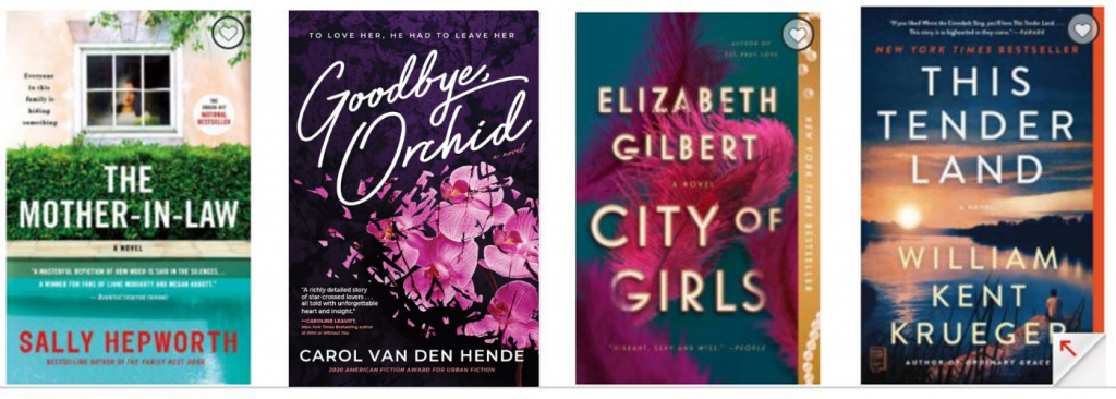
Be sure to assess design not only at full size but as a thumbnail, next to other covers from the same genre. It’s tempting to view your cover oversized on your screen and to nitpick about the little details. But especially for titles that primarily sell as ebooks, it’s more important to see them in a real-life situation. After all, thumbnails are often all online shoppers first see of your cover. So shrink them to real-life screen size and assess the title legibility, whether the cover will be distinctive and easily recognisable, as well as whether it can ‘pop’ versus other books in your genre. Designers have a bevvy of strategies to achieve this break through, including the contrast of colours, font-weight, and a mix of serif and sans serif fonts.
If your book will be in physical distribution, pay attention to the spine, as that may be all readers see of your cover design in bookstores or libraries. Check to see if the title and author name are legible at a glance.
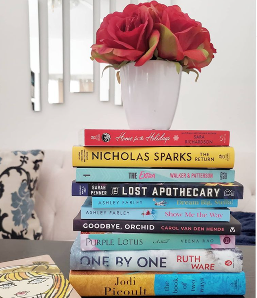 Source: Instagram @the_unwined
Tip Five: Consistency, consistency, consistency.
After you have designs in hand, consistency is king.
The truth is, the path to purchase is rarely linear. Because most of our lives are busy and full, research has found that it can take two to seven exposures for a new product or item to break its way into our consciousness. As authors, that means it benefits us to stack our impressions, be relevant in content and placement, and be visually consistent. This helps break through, because human brains naturally scan for patterns and once readers have seen your cover(s) multiple times, they will be more quickly recognised next time. Readers have told me that, because I’ve consistently used the shattered orchids to represent my novel Goodbye, Orchid, they’ve come to associate orchids with my book.
In summary, design is important because in crowded physical or digital spaces, a book may only have seconds to catch a reader’s attention. Good book cover design can break through. Mediocre design can get lost. So remember the five tips to SPARC great design:
Tip One: Simplicity breaks through, so don’t try to stuff everything onto the cover. Rather, focus!
Tip Two: Prioritise your communications hierarchy.
Tip Three: Assess designs against the brief, not personal taste.
Tip Four: Real-life: assess design in situ.
Tip Five: Consistency, consistency, consistency.
Please connect with me online: (linktr.ee/cvdh) or read my other articles on design and more:
writerswin.com/applying-professional-design-principles-to-book-cover-design/
www.creativindie.com/using-book-design-graphics-in-your-launch-and-marketing-plan/
1 University Of Rochester: www.rochester.edu/pr/Review/V74N4/0402_brainscience.html
About The Author
 CAROL VAN DEN HENDE is the award-winning author of Goodbye, Orchid, a public speaker, and MBA with 20+ years’ experience in marketing, strategy and insights. Plus, she works in chocolate (there’s no ‘sweeter’ job!). Carol is passionate about simplifying marketing concepts into actionable steps that authors need for publishing success. She’s keynoted and presented at conferences like Writer’s Digest, NJ-SCBWI, NJRW, Rutgers Writers’ Conference, Sisters-in-Crime and Women Who Write. Authors have said about Carol’s presentations: “Clear, articulate, organised speaker who is both an expert in field and excellent speaker.” “You can feel the love and passion for what you do as much as how knowledgeable you are. I walked away confirming I was on the right path and excited to apply all you have shared and inspired. Thank you so much!” “Wish it was all day. Can never get enough of you.” “You inspire me and fire me up every time. I can’t wait to market my book and my ‘why’!”
*****