By Martha Harris
In the last year, I’ve worked on projects in order to develop my portfolio, with my tutors providing briefs to mimic projects I may come across when working in the design industry.
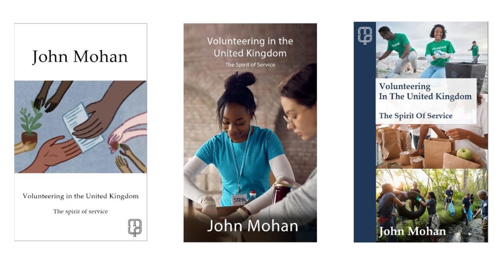
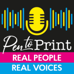
This project, designing the cover for Volunteering In The United Kingdom: The Spirit Of Service, by John Mohan, however, was a live brief. This means it’s a real project, often with a deadline (and sometimes paid), which students can undertake to experience a design project in the real world.
When Manchester University Press presented this brief to my class at university, I knew I couldn’t pass up the chance to design for a real publisher in my home city.
I graduated from ‘Illustration With Animation’ at Manchester Metropolitan University in 2020 and became increasingly interested in book design and production throughout my studies.
Then, in 2022, I began my Masters in Publishing. I’ve always considered myself an artist but, as my design knowledge increases, I’d also now consider myself a designer.
When Manchester University Press offered the opportunity of designing this book cover, I was excited to create ideas for a non-fiction book. As an avid reader and creative, I find myself inspired by illustrated book covers. This project presented the challenge of designing a photograph-based cover. It was amazing to face such an unexpected challenge and I can see how my design capabilities have grown throughout and since the initial design process.
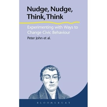
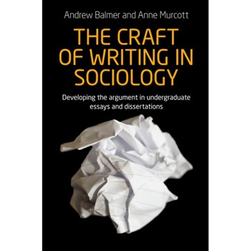
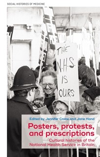
I began by looking at comparative titles suggested by Manchester University Press, some of which can be seen in images two and three. These covers make minimal use of colour, have simple lines and use text that is distinctly separate from the imagery. They also have smaller typography for author names, and I knew I wanted to go against this to better represent the author as being renowned in his field.
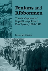
One of the requirements of the brief was that the design didn’t look like a textbook. I looked through the publisher’s back catalogue, which showed me this was their house style. The books I looked to for inspiration can be seen in images four and five. Both have modern designs for non-fiction covers.
The book is intended for use as a coursebook. It must also serve as a source for voluntary organisations. I therefore felt a modern look would appeal to the target audiences.
From this point, I made a few sketches of ideas before looking at stock photographs of volunteers. I wanted to meet the brief and ensure that I didn’t portray volunteering as exclusive or closed off to specific groups of people. I searched for a mix of activities to encompass a realistic group of volunteers in the UK. My sketches can be seen in image six.

I played with the layout of these images until they closely resembled the book covers I’d been looking through. I noticed the stock images contained a lot of blue, so I used blue across the designs. This helped to link the stock images more seamlessly with the plain backgrounds.
In design, every little choice can tell the story of a book.
The typeface, which some people call a font, can inform the viewer if the ideas are modern or traditional. It can tell us if the book is an academic resource or a work of fiction. The typefaces I chose are contemporary in style and welcome a wide variety of readers.
My design ideas can be seen below in image seven.
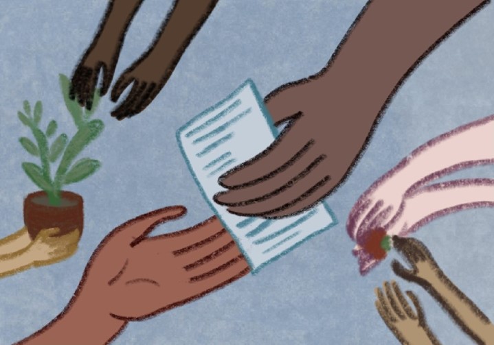
The first design is an illustration I produced. I wanted to represent volunteering as a helping hand, but I struggled to find any photographs to demonstrate what I had in mind. So, I illustrated this image instead. Due to the range of colours used, I left the rest of the design very minimal.
I chose very few colours for the background and other details to allow the images and the text to stand out. In tandem with the photographs, a busy background might risk making it look like a work of fiction.
Using the comparative titles to inspire the layout, I designed two ideas using stock images. I combined the photographs with my colour choices, blue and white and experimented with a different composition for each, while keeping them minimal and modern.
The design process took longer than anticipated, especially as I’m more familiar with fiction. Nonetheless, through referring to the comparative titles as inspiration, I managed to produce designs I’m happy with.
I’m excited to see where the design process goes from here. As previously mentioned, this is my first live project and I’m keen to learn as much as possible from the process!
*****
Issue 17 of Write On! is out now and you can read it online here. Find it in libraries and other outlets. You can find previous editions of our magazines here.
You can hear great new ideas, creative work and writing tips on Write On! Audio. Find us on all major podcast platforms, including Apple and Google Podcasts and Spotify. Type Pen to Print into your browser and look for our logo, or find us on Podcasters.Spotify.com.
*****
If you or someone you know has been affected by issues covered in our pages, please see the relevant link below for information, advice and support: https://pentoprint.org/about/advice-support/